
Contents
- Overview
- The Canadian Conundrum: In Search of a Decent Valuation Metric
- The Most Reliable Valuation Measure for Canadian Stocks
- Fooled by Noise: Why Valuation Measures Don’t Predict Nominal Returns
- Predicting Future Canadian Stock Market Returns
- Appendix: Data and Methodology
Overview
In this article we’re going to analyze several popular valuation metrics and compare their relationship with future 10-year returns of the Canadian stock market. Unlike existing studies of Canadian valuation metrics which tend to use relatively limited sample data, we’re going to extend our analysis as far back as 1966. We’ll show that over this longer time period only one valuation metric stands out as a reliable predictor of future stock market returns for Canada. Furthermore, as the chart below shows, if we narrow our time frame to the more recent past, this metric can be used to accurately forecast future TSX returns with a predictive strength – or R² – of 84% going back to January 2000.

We’ll further demonstrate that other commonly used metrics such as CAPE, Dividend Yield, and Earnings Yield (and by extension P/E), have extremely limited use as valuation measures for the TSX. These metrics are regularly used by Canadian investors as market timing signals, yet they have virtually no predictive power with respect to future Canadian stock market returns. Any evidence to the contrary is simply due to happenstance – an artefact of noise in the data set. When we remove this noise from the analysis, the empirical support for these alternative metrics all but evaporates while the predictive power of our preferred valuation measure improves dramatically. Finally, having presented the most accurate predictor of Canadian equity returns, we’ll argue that the metric shouldn’t be viewed in the context of a market-timing tool so much as it should a financial planning and portfolio allocation tool. In this context, we’ll explore what the metric is currently saying to investors regarding Canadian equity market returns over the next 10 years.
The Canadian Conundrum: In Search of a Decent Valuation Metric
Stocks bought at high prices tend to lead to low future returns, but on what basis are we to make the claim that current equity prices are either “cheap” or “expensive”? Canadian investors regularly apply commonly used valuation metrics to the TSX in support of their bullish or bearish leanings, but there’s no reason for us to blindly assume that what works in other markets around the world will work in Canada as well. A valuation metric is only useful, after all, if it has some sort of predictive power towards future stock market returns. Otherwise, it’s simply a pointless statistic – a metric not worth knowing.
Consider, for example, the widely used Cyclically Adjusted Price-to-Earnings Ratio (CAPE), also known as the Shiller PE. As one of the most popular valuation metrics used by investors around the world, CAPE is designed to measure stock prices relative to “smoothed-out” corporate profits. The metric is calculated by dividing the stock market’s price by the average inflation-adjusted earnings over the previous 10 years. In the chart below we show monthly CAPE values for the TSX from 1966-2023.
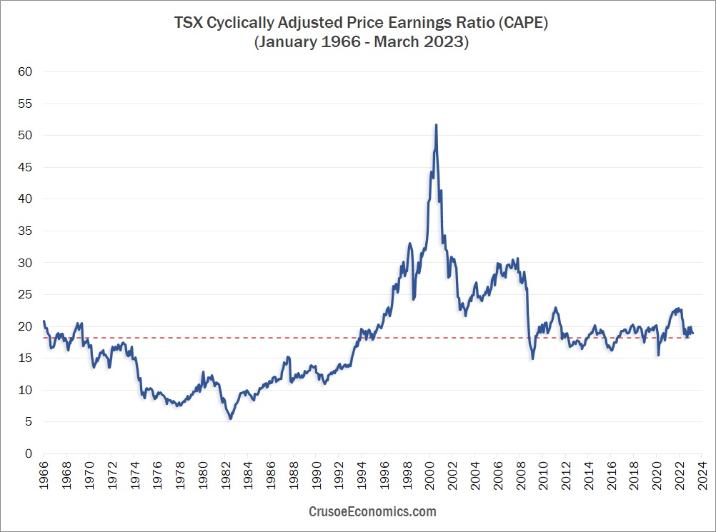
As of March 2023, CAPE for the TSX stood at approximately 19, which is more or less in line with it’s long-term historical average (the red line in Figure 1). A superficial interpretation of this graph would be to conclude that current stock prices are neither grossly overvalued nor grossly undervalued, but are being offered up to investors at a fair and reasonable price based on historical valuations. Given that the market is within a stone’s throw of it’s supposed “fair value”, a Canadian investor looking at buying stocks today might reasonably expect somewhat average equity returns over the next 10 years. Unfortunately, there’s one massive problem with this assumption: at its current valuation, CAPE has almost zero ability to accurately forecast future TSX returns. Forget about the numerous US-based studies touting the remarkable predictive power of CAPE. In Canada, the theory simply doesn’t stand up to the data.
This fact will be profoundly disturbing to those Canadian investors who continue to use CAPE as an indicator of stock market valuation. When we empirically measure CAPE’s predictive strength with respect to future equity returns, we get a shockingly low R² of just 0.07 since 1966. Yet despite its horrible track record at forecasting future equity returns, CAPE continues to be widely used by Canadian investors as a popular measure of “value”. Yes, current CAPE levels may be close to their historical average, but so what if it is? If valuation metrics tell us little about future equity returns in Canada, then why should we care about them at all? The answer is we shouldn’t. We should discard these types of metrics in favor of other more predictive measures that are more highly correlated with subsequent equity returns. Now we can already hear the chorus of protests emanating from the value-investing crowd in defense of their revered CAPE multiple. To these critics, we suggest that you tell it to the judge. And by the judge, we mean the data.
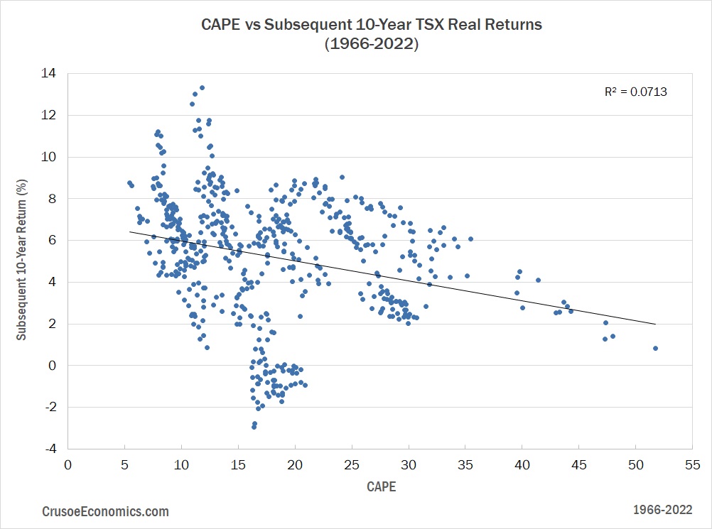
Figure 2 shows the relationship between the CAPE ratio (x-axis) and subsequent 10-year real returns of the TSX (y-axis). We can see immediately that, over the entire data series, the predictive relationship is simply a mess. Yes, it’s clear from the regression line we’ve drawn on the scatterplot that higher CAPE values generally lead to lower future 10-year returns, but the fit is simply atrocious. For CAPE values between 10 and 20, future 10-year equity returns span anywhere from -3% to 14%. Clearly this is far too wide of a range to make CAPE even remotely meaningful to investors looking for an indicator of whether the stock market is currently cheap or expensive. Given today’s CAPE value of 19, there’s simply no actionable conclusion an investor can draw from the jumble of points in Figure 2 – the dispersion around the regression line is simply too large.
Now, the fact that the regression line slopes downwards at all tells us that higher CAPE values are at least somewhat predictive of lower future returns, but we can see in Figure 2 that most of this predictive power is drawn exclusively from CAPE values ranging from 25 to 55. If we look closely at the entire set of CAPE values charted in Figure 1, we can see that the 25 to 55 range corresponds to the extremely elevated market valuations which characterized both the dot-com bubble and the run-up to the 2008 financial crisis. Indeed, if we were to eliminate the data points in Figure 2 with a CAPE of 25 and higher, we would be extremely hard-pressed to even guess what our regression line should approximately look like. Yes, CAPE is somewhat predictive of subsequent equity returns, but only at bubble-level valuations. For all other cases, as far as valuation metrics go, CAPE is next to useless.
Canadian investors need to accept the fact that many traditional valuation metrics like CAPE fail to show the strong relationship with future long-run equity returns that investors often assume. If after seeing the chart above you still want to argue that CAPE is a valid arbiter of value for the Canadian stock market, then you might as well be making equity forecasts based on cloud patterns in the sky – the ground you’re standing on is that tenuous. As Figure 2 shows, changes in the CAPE ratio over time explain only 7% of the variation in subsequent 10-year returns. Now that number obviously isn’t zero, but for all practical purposes, it might as well be. Quite frankly, nobody anywhere should be making buy/sell recommendations for the TSX using a valuation metric with a predictive power of only 7%.
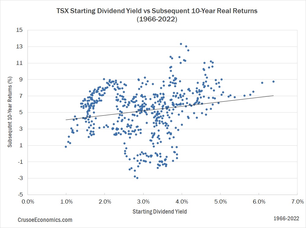
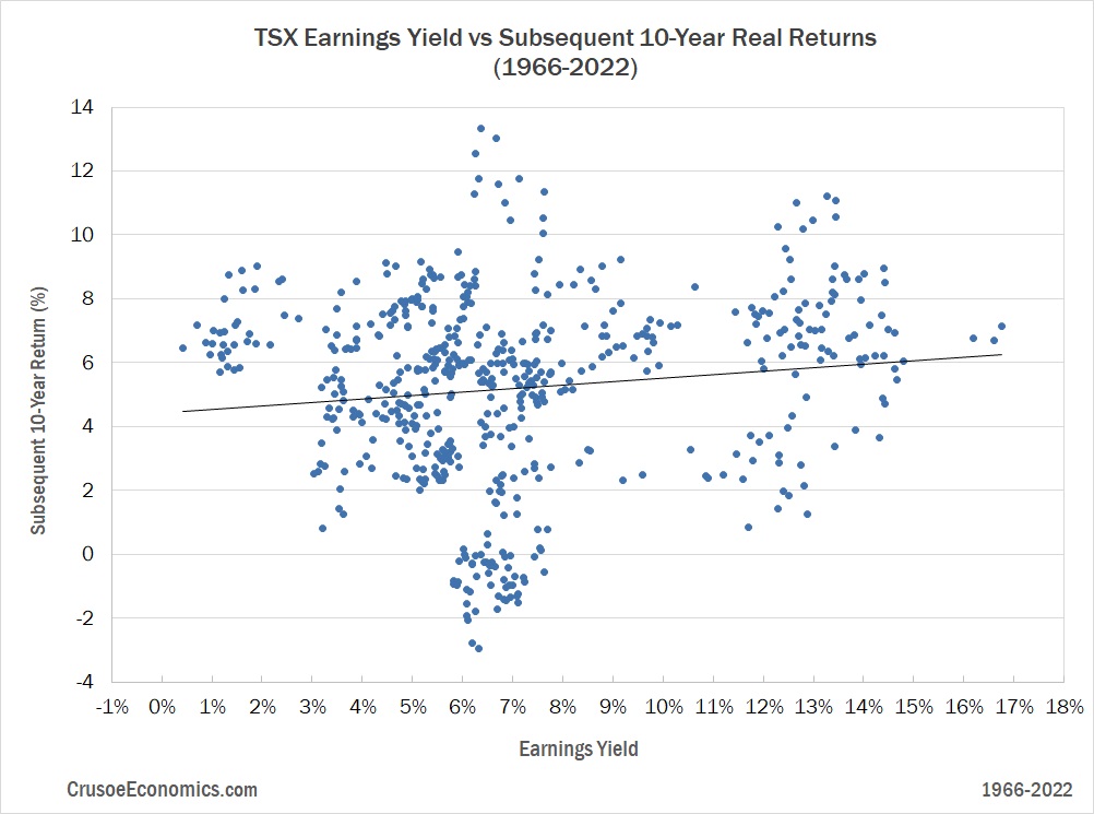
Of course, not every Canadian investor is going to use CAPE as their preferred stock market valuation metric. Other more traditional investors, for example, prefer to use the starting dividend yield as their favorite indicator of stock market value. But is the starting dividend yield of the TSX historically any better at forecasting future long-term equity returns than CAPE? Not according to our data. And what of another investor favorite – the trailing 12-month P/E (or earnings yield)? Here too, we calculate almost zero relationship between the TTM P/E and future equity returns. As the analysis of CAPE showed us, the predictive relationships that tend to hold true in many other international markets don’t necessarily apply to Canada, yet few investors have bothered to actually validate these relationships from a Canadian perspective. In the next section, we’ll do exactly that, and in doing so we’ll share with the reader exactly what we’ve determined to be the most reliable predictor of future Canadian stock market returns.
The Most Reliable Valuation Measure for Canadian Stocks
In our experience, when Canadian investors confidently make claims that the TSX is either “overvalued” or “undervalued”, they do so with little knowledge of the long-term relationship between their chosen valuation metric and subsequent stock market returns for Canada specifically. In this section, we’ve analyzed the relationship between various commonly used stock market valuation metrics and subsequent 10-year real returns of the TSX. We include the following valuation metrics in our analysis:
- Market Capitalization to Nominal GDP
- Average Investor Equity Allocation
- Shiller Cyclically Adjusted Price to Earnings (CAPE)
- Market Value to Book
- Dividend Yield (based on TTM dividends)
- Earnings Yield (inverse of P/E, based on TTM earnings)
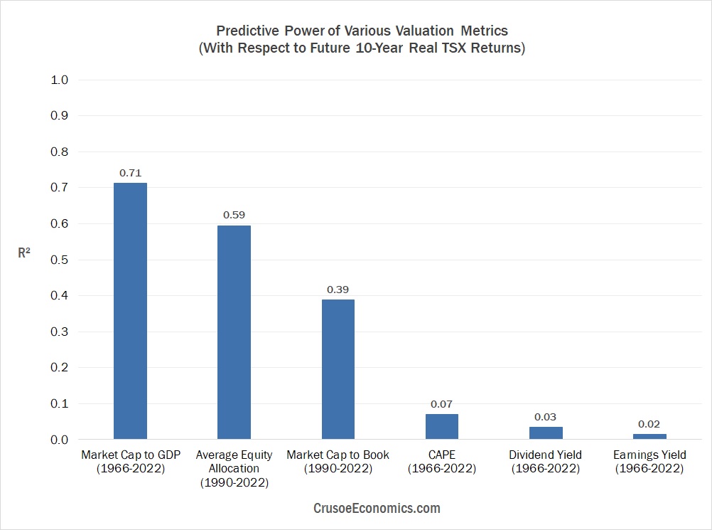
Unlike US equity markets, Canada doesn’t have 100+ years of financial market data available to compare the track record of these valuation metrics over the truly long-term. Due to limitations in Canadian economic data, for example, our analysis of Average Investor Equity Allocation and Market Value to Book goes back only as far as 1990. Fortunately, after incorporating a series of reasonable data approximations and making a few small assumptions, we have managed to extend our data set for the remaining 4 valuation metrics back a great deal further. Figure 3 compares the predictive power of each of these valuation metrics going back to 1966.

We can immediately see that Market Cap-to-GDP has the highest predictive power of the various valuation measures we’ve analyzed in Figure 3, and the contest isn’t even close. Market Cap-to-GDP is measured as total stock market capitalization divided by trailing twelve-month nominal GDP, and with an R² of 0.71, it simply blows the competition out of the water.
In contrast to the scatterplot of CAPE we showed in the previous section, Figure 4 shows the equivalent scatterplot of Market Cap-to-GDP versus subsequent 10-year real returns of the TSX. We can immediately see the improvement.

While we can definitely see some large outliers in the data, most of the points plotted in Figure 4 generally form a decent fit around the linear regression line. Yes, there’s still a fair amount of dispersion that can be seen around the trendline, but it’s significantly less than what we saw for CAPE where valuations only became predictive of future stock market returns as they approached bubble-like territory. By contrast, the relationship between Market Cap-to-GDP and future TSX returns is much more obvious over the entire data set, with higher valuations leading to clearly lower 10-year future returns and lower valuations leading to clearly higher future 10-year returns. The next closest valuation metric to Market Cap-to-GDP is CAPE, but we’ve already seen how CAPE has a shockingly low R² of 0.07. Canadian investors interested in estimating future equity market returns would be far better served using more reliable measures of stock market valuation. As Figure 3 showed us, however, dividend yield and earnings yield (and similarly P/E) aren’t any better.
The fact that the current dividend yield is such a poor measure of stock market valuation is sure to come as a shock to your average Canadian retail investor. Canadians, after all, tend to love their dividend paying stocks, generally adhering to the belief that a high dividend yield is typically indicative of a low current valuation. While this might be true for certain segments of the market and for certain individual stocks, on aggregate for the entire market, the current dividend yield has an extremely low correlation with future equity returns. With changes in the dividend yield explaining only 3% of the variation in 10-year real returns, it’s predictive power over future returns is almost non-existent. As Figure 5 shows, the scatterplot is a complete mess.
Worse still is earnings yield, which is merely the inverse of the trailing 12-month P/E ratio. While most experienced investors are generally aware that the TTM P/E is far from the best valuation metric available, we’d be surprised if the majority of investors realized just how poorly P/E serves as a measure of value for the Canadian stock market. The mistake isn’t just limited to everyday DIY retail investors either. We’ve seen various investment publications and commentators over the years touting the TSX P/E ratio as an indicator of the market’s clear state of “overvaluation” or “undervaluation”. They clearly have no inkling that the P/E ratio, with an R² of only 0.02 from 1966-2022, is more or less a useless metric for predicting future equity returns. As Figure 6 shows, the earnings yield (and by extension the P/E ratio) is the absolute worst valuation measure of all those included in our analysis.
Note that in our comparison thus far we’ve deliberately included only 4 of our 6 possible valuation metrics. We’ve done this because our data for both Average Investor Equity Allocation and Market Value-to-Book goes back only as far as 1990, and in order to do a proper apple-to-apples comparison, different valuation metrics should really only be compared over the same time horizon. In Figure 7, we’re going to break from this tradition and display all 6 of our valuation metrics for completeness, although the comparison to Average Investor Equity Allocation and Market Value-to-Book should be taken with a healthy dose of skepticism due to the different time periods covered.
Even in this new less-reliable apples-to-oranges comparison, neither of the 2 new additional valuation metrics were able to surpass the predictive ability of Market Cap-to-GDP. Jesse Livermore’s Average Investor Equity Allocation model comes a lot closer than the others, although we reiterate that the data set for this metric is quite small for Canada – going back only to 1990. Of course, if we truly wanted to do a true apples-to-apples comparison for all 6 of our valuation metrics, we would do a similar analysis over the period spanning 1990 to 2022 (the longest time span for which we have data of all 6 metrics). True, we’d be leaving out nearly 25 years of data from the analysis for 4 of our valuation metrics, but for arguments sake, let’s re-run the comparison going back to 1990 to see if it materially changes the results of our analysis.
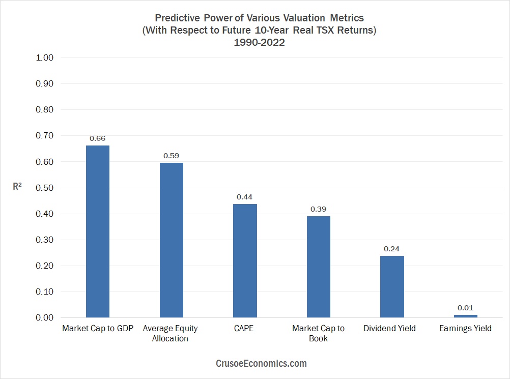
The results from our 1990-2022 comparison are interesting, but they don’t offer a material challenge to the overall conclusion of the study. Market Cap-to-GDP clearly has a bit more competition this time around, but it’s still the most reliable predictor of Canadian stock market returns with an R² of 0.66. What’s notable, however, is that over this new time period, the predictive power of CAPE has jumped from 7% all the way to 44% while the predictive strength of the starting dividend yield has increased from 3% to 24%. Earnings yield (and by extension P/E), with a predictive strength of 1%, is still as meaningless now as it was before.
Given the new higher correlations of CAPE and Dividend Yield in Figure 8, it’s worth considering if we’ve been unduly harsh in our criticism of these two valuation metrics. Perhaps we’ve overstated our argument by considering their predictive strength over the entire 1966-2022 time period to the exclusion of discrete sub-periods. After all, over a 50+ year data set it’s virtually certain that there will be periods where the correlation with future stock market returns won’t be as strong as other periods. The hope is that these periods will turn out to be few and far between and that they aren’t significant enough to completely invalidate the predictive ability of the model. However, we can’t be 100% sure of that. It’s foreseeable, for example, that CAPE might have generally been an excellent predictor of future TSX returns from, say, 1980 to 2022, but that the 1970s contained some specific economic circumstances that caused the predictive power of the metric to completely collapse over that particular time period. This might lead to an overall R² that appears outwardly low, while simultaneously masking the possibility that CAPE might still be a reasonably useful valuation metric going forward (assuming the conditions of the 1970s are an aberration and unlikely to repeat).
In order to be sure, then, that we aren’t dismissing CAPE and dividend yield prematurely, we’re going to look back in time and see how each of our valuation metrics have done over all “look-back” periods going back to 1966. We’re going to start by looking at their ability to predict future 10-year returns over the last 20 years, and gradually bring in more and more data to see how their predictive power changes over time. If the R² value begins to decline significantly we’ll know that subsequent 10-year returns over the newly included time period are poorly correlated with valuation. Alternatively, f the R² value begins to rise significantly we’ll know that subsequent 10-year returns are strongly correlated with the valuation metric over the newly included period. In Figure 10, the y-axis plots how well each valuation metric predicts subsequent 10-year real TSX returns (measured by R²) over the specified look-back period. The x-axis represents the end date of each look-back period, with the start date being fixed to the end of 2022. So, for example, January 1966 represents the period from 1966 through 2022, while January 2003 (the right-most date on the chart) represents the period from 2003 through 2022. The easiest way to interpret this chart is to begin at the far right to obtain the initial R² value from 2003-2022. As we gradually move left along the x-axis we bring more and more data into the analysis, allowing us to visualize exactly how the relationship changes between each metric and future 10-year equity returns as we extend the data set back through history.
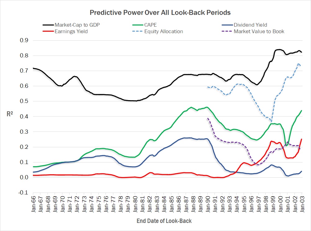
Figure 10 provides us with fairly compelling evidence that the superiority of Market Cap-to-GDP is robust and stable across the entire data set. It’s true that it’s predictive strength ebbs and flows as we move back over the various look-back periods, but it’s R² never deteriorates below 50%, and its average R² over all look-back periods is still a fairly respectable 62%. By contrast, CAPE’s R² never climbs above 50%, is rarely over 40%, and has an average R² over all look-back periods of only 24%. Importantly, no competing valuation metric over any look-back period has managed to trump Market Cap-to-GDP’s ability to predict future equity market returns. The clear superior predictive ability of Market Cap-to-GDP in Canada is the reason why we’ve incorporated this specific valuation metric into our forecasting model for the TSX over the last several years. While an R² of 0.71 since 1966 is a far cry from some of the higher R² values we see among other valuation metrics in the US, Market Cap-to-GDP is still the single best valuation metric of those we’ve analyzed for Canada.
While we aren’t going to show the scatterplots of all 6 valuation metrics from our analysis, we can confidently say that the fit for Market Cap-to-GDP is tighter than any of the other valuation metrics we’ve studied to date. As far as we’re concerned, our analysis has effectively discredited CAPE, Dividend Yield, and Earnings Yield (and by extension P/E) as viable valuation metrics in the Canadian equity space due to their extremely low correlations with future stock market returns. Average Investor Equity Allocation and Market Value to Book are certainly better, but the limited data size means they haven’t been stressed over the same economic conditions as the others, casting significant suspicion over their long-term reliability. As far as stock market valuation metrics go in Canada, based on data stretching back 1966, we have considerable confidence in our claim that Market Cap-to-GDP is the most reliable valuation measure for the Canadian stock market.
Fooled by Noise: Why Valuation Measures Don’t Predict Nominal Returns
Now the skeptics are going to argue against the results of our analysis on the basis that we’ve used future 10-year real returns rather than nominal returns. They’re going to accuse us of cherry-picking the data that supports our pre-determined conclusion, since nominal returns tend to show a much stronger predictive relationship with traditional valuation metrics like CAPE and P/E. They’re going to claim that the only reason we’ve chosen real returns is because using nominal returns would completely discredit our preferred valuation metric, and in doing so they’re probably going to point to a chart similar to the one below.

When we compare the predictive strength of our various valuation metrics in Figure 11 using nominal returns rather than real returns, we get strikingly different results. No longer is Market Cap-to-GDP the single best predictor of future equity returns, but with an R² of just 0.2, it’s now the absolute worst valuation metric of those included in our study. Where we previously determined CAPE, Dividend Yield, and Earnings Yield to be utterly atrocious measures of stock market value, they now appear to have a significantly higher predictive strength of approximately 40%. By simply switching from real returns to nominal returns, we’ve seemingly invalidated our original conclusion with respect to the superiority of Market Cap-to-GDP as a predictor of future equity market returns. Indeed, when we look at the scatterplot for Market Cap-to-GDP without stripping out inflation from our returns data, it no longer follows a nice clean pattern with the data points closely hugging the trendline. Instead, it devolves into a visual mess.

At first glance it might seem that our critics have a point – the fit around the regression line in Figure 12 is obviously extremely poor. But they’re missing the key point, which is that the fit is extremely poor precisely because it should be extremely poor. Valuation metrics, to say it bluntly, don’t accurately predict nominal returns, and there’s no reasonable theoretical framework to explain why they should. In that sense, then, the scatterplot above is showing us exactly what we’d expect to see when we introduce significant noise into the analysis. Market Cap-to-GDP, after all, doesn’t have any embedded knowledge about future levels of inflation, so why should we reasonably expect the introduction of noise into our analysis to do anything except reduce the metric’s predictive relationship with future equity returns. Adding inflation is going to have a distortive effect in the sense that it’s going to unpredictably inflate future nominal stock market returns in varying ways over the full sample data set. And because it’s going to do so in ways that we can’t possibly know in advance by simply looking at some arbitrary valuation metric today, predicting nominal returns should be a great deal less accurate than predicting real returns.
Now if our theory is sound, once we know the magnitude of inflation over a given period of time, it should be a relatively simple task to predict how the introduction of inflation into the data is going to distort our analysis. Stocks are claims on real assets, after all, and inflation-driven changes to the general price level are going to lead to similar upwards adjustments for things like nominal corporate revenues and profits (which eventually feeds through to higher nominal stock market returns). During the inflationary 1970s, for example, nominal corporate profits of Canadian businesses rocketed skyward in response to the double-digit levels of inflation, while real earnings growth was far more muted.
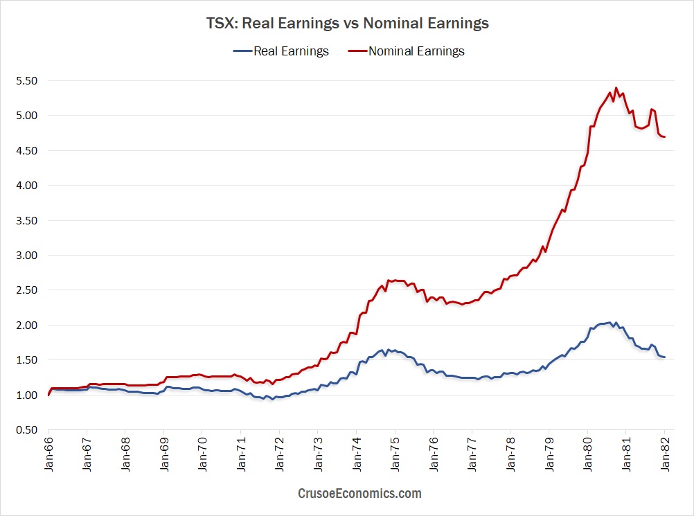
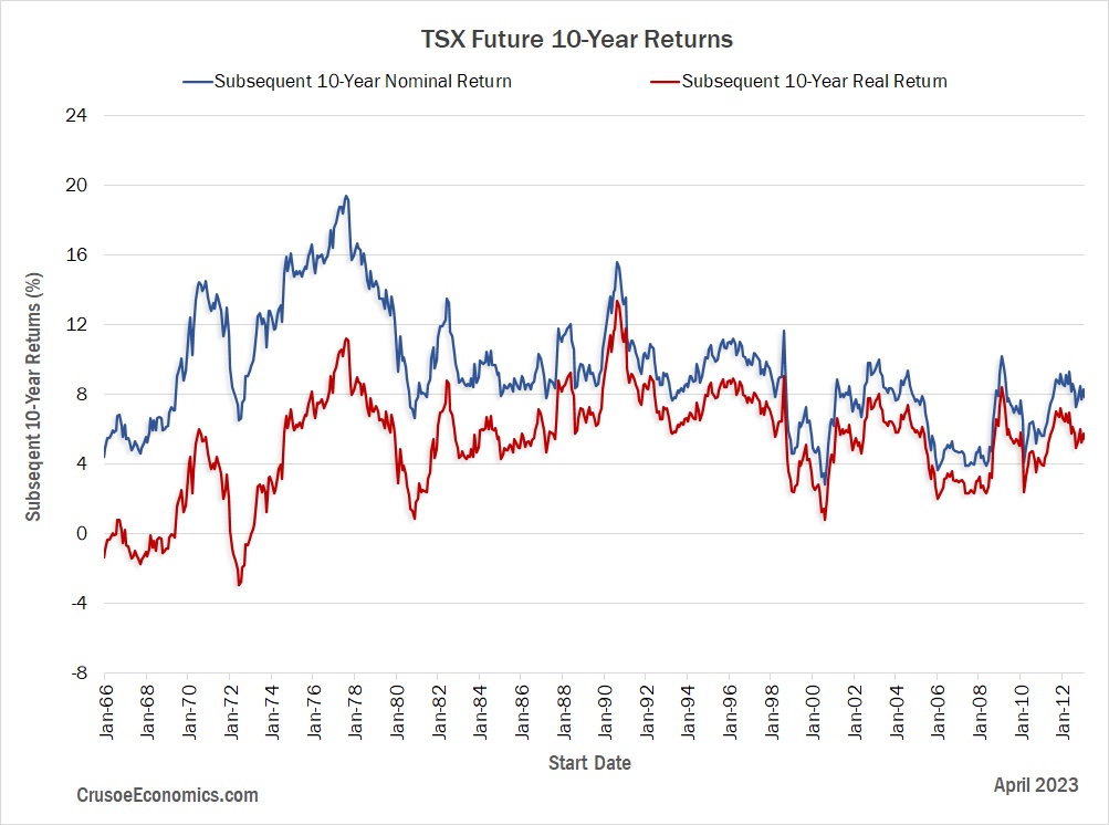
As Figure 13 illustrates, periods of high inflation are consistent with higher nominal profits as companies move to increase prices, which subsequently boosts the nominal returns of stocks. It should therefore come as no surprise that periods of higher inflation are correlated with higher future nominal stock market returns, and periods of lower and stable inflation are going to lead to lower future nominal returns, relatively speaking. If we look at a graph plotting future 10-year nominal TSX returns versus future 10-year real TSX returns, this is precisely what we end up seeing (Figure 14). During periods which overlap the inflationary 1970’s (i.e. 1966-1980) we see that subsequent 10-year nominal returns were generally elevated relative to periods of lower inflation. The higher 10-year nominal returns encountered during the pre-1980 period are therefore entirely consistent with what we would expect based on the higher inflation levels of the 1970s.
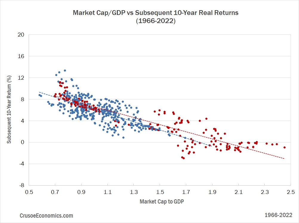
Let’s take a moment now and turn our attention back to Figure 12. For a given valuation level, then, we should expect that the introduction of highly variable inflation into the analysis is going to lead to considerable dispersion around the trendline, which is exactly what we see. Because the inflation of the 1970s is significantly higher than during other periods over our full data set, nominal stock market returns during periods that include the inflationary 1970s are going to be considerably higher than during those periods which don’t. More simply stated, subsequent 10-year nominal TSX returns are going to be skewed massively higher during the pre-1980 period versus the post-1980 period due to the higher inflation of the 1970s. To better visualize this, we’ve redrawn the scatterplot from Figure 12 to break out the pre-1980s period separately from the post-1980s period. Figure 15 shows this new scatterplot, with the inflationary pre-1980s period in red, and the post-1980s period in blue.

What we see in Figure 15 is fairly illuminating and completely consistent with what we would expect based on the framework articulated above. The pre-1980s and post-1980s periods, when considered separately, tell much the same story. The regression lines for these two periods obviously aren’t identical, but they both show a clear relationship of higher Market Cap-to-GDP values being correlated with lower future 10-year returns. Now when we originally added both periods together and attempted to blindly draw our regression trendline through the entire data set in Figure 12, we calculated a fairly low R² value since the high inflation of the pre-1980s had heavily distorted nominal returns over that time period. It’s only when we decompose the data into the two different periods that it becomes obvious that the relationship breaks down almost entirely due to the substantial inflation of the 1970s. This correspondingly has a massive crippling effect on the predictive strength of the entire model and is precisely why valuation metrics aren’t reliable predictors of nominal returns. When we strip out inflation from the returns data and re-draw the scatterplot using real returns instead of nominal returns, we see that the pre-1980s data falls right in line with the post-1980s data.
Our critics, then, have seemingly taken a very odd position indeed. They seem to be arguing that the introduction of noise into the data set should actually improve the predictive strength of valuation metrics like CAPE and P/E. As we’ve just demonstrated, however, inflation is going to have a distortive effect on returns which will make the relationship less reliable, not more so. If a valuation metric is becoming more predictive of future returns when using nominal returns as opposed to real returns, we can be sure that this is simply a result of happenstance – a random fluke. If we take any poorly correlated valuation measure and we arbitrarily increase the corresponding future nominal returns, we’re bound to encounter scenarios where the correlation between the two coincidentally becomes stronger. But the reason the correlation becomes stronger is just dumb luck – it doesn’t fit any sort of theoretical framework that’s sound and reasonable, and it’s certainly not going to be a repeatable or reliable relationship that we can bank on going forward. In fact, the only real reason to use nominal returns instead of real returns is because the nominal returns data more closely aligns with a certain desired narrative. Critics pointing to the nominal return data as their preferred measure are ultimately the ones “cherry-picking” the data to support their pre-determined conclusion. The arguments they’re making are either disingenuous or misinformed. But either way, they’re wrong.
Predicting Future Canadian Stock Market Returns
At this point it really shouldn’t be controversial to state that Market Cap-to-GDP is the most historically reliable valuation metric that currently exists for Canadian stocks. But even if this is true, does knowing the current valuation of the TSX actually help investors make better decisions with their money in the here and now? A valuation metric is only useful, after all, if it provides us with some kind of actionable information with respect to our investment strategy and equity allocations. If we can forecast future 10-year equity returns within a fairly tight range based on current valuations, then we should theoretically be able to either overweight or underweight our equity positions accordingly. Now, the simplest way for us to “predict” these future returns is by taking our original scatterplot graph and visually identifying the corresponding 10-year forward return for any given Market Cap-to-GDP value. As of June 2023, the TSX was trading at a Market Cap-to-GDP of 1.14. If we draw a vertical line at 1.14 on our x-axis in Figure 17, we can estimate future 10-year equity returns based on where it intersects our best-fit trendline.
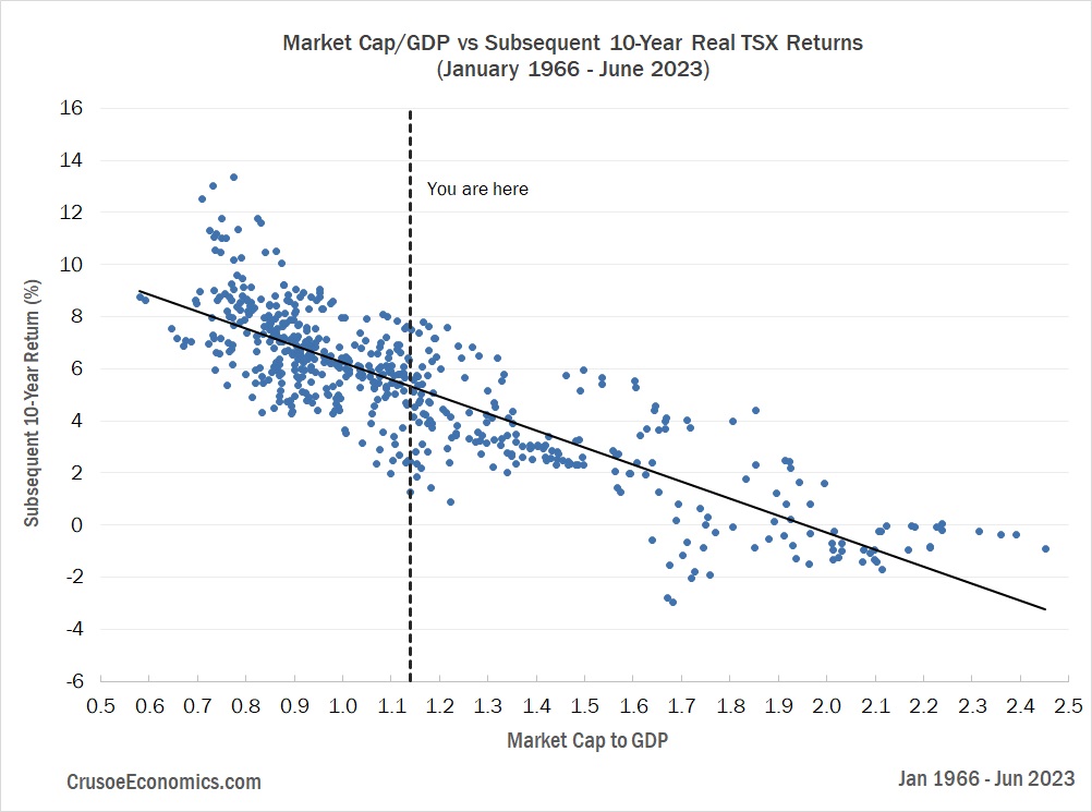
At the current valuation of 1.14, future real returns for the TSX are expected to come in at 5.23% per year over the next 10 years. Even though Market Cap-to-GDP correlates with future equity returns better than any of our other valuation metrics, we can still see from Figure 17 that at a valuation of 1.14 we have a large dispersion in returns ranging from as low as 1% to as high as 8%. We can more generally quantify the possible range of returns for a given valuation level by first sorting the historical data by Market Cap-to-GDP and then grouping them into quintiles. We then calculate the average, median, minimum, and maximum 10-year returns for each quintile, as shown below.
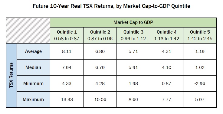
Quintile 1 represents the lowest 20% of historical valuations within our data set and quintile 5 represents the highest 20%. We can see as we traverse the range of valuations starting from quintile 1 and moving higher through to quintile 5, the average, median, minimum, and maximum 10-year returns all decrease accordingly, which is consistent with the graphical depiction in Figure 17. The current valuation of 1.14 just barely falls within quintile 4, suggesting an average 10-year real return of 4.31% with a lower and upper range of 0.87% and 7.77% respectively. Again, this is fairly consistent with our previous estimate based on our visual analysis of Figure 17, although perhaps a bit on the low side. It’s a fair question to ask, of course, whether a 7% spread in projected returns is at all useful to today’s investors attempting to make asset allocation decisions amongst a limited array of investment options. After all, a 10-year 1% real return is a world apart from an 8% real return, and depending on where you end up within that range, a simple GIC might well turn out to be the better option. Even using the most reliable valuation metric we have available in Canada, telling someone that they should expect somewhere between 1% and 8% over the next decade isn’t a particularly helpful forecast. It’s probably not going to be useful to investors attempting to nail down the timing of their next meaningful stock purchase, and it’s certainly not going to be useful to those investors attempting to trade in and out of their equity positions based on an objective measure of what’s “cheap” and what’s not.
Now, we can try to narrow down the prediction to something more reasonable by calculating the range of returns most likely to be realized by investors over the next decade. If we take the difference between each actual realized 10-year return and the return predicted by our trendline, what we’re left with is a series of forecasting errors. The standard deviation of these errors over our entire data set is 1.54%, meaning that 67% of the time future 10-year real returns will fall within plus or minus 1.54% of our estimate. At a current Market Cap-to-GDP of 1.14 our forecast for future 10-year real returns of the TSX is 5.23%, meaning that over the next 10 years, based on the historical data, we have a 67% probability that annual returns will fall within the range of 3.69% to 6.77%. Now, a 3% range in our predicted return is certainly a much more useful range than our previous 7% spread, but with a probability of only 67%, it means there’s a 33% chance that actual 10-year returns will fall somewhere outside that range, and possibly significantly so.
As an investor, are you really willing to make a substantial bet on the direction of the market knowing that a third of the time you’ll be grossly off your baseline forecast? Probably not. But that doesn’t make the forecast useless. For every single available investable asset, we, as investors, need some sort of expectation of prospective returns, otherwise we’d have no idea how much of our capital to allocate to stocks, bonds, cash, or any other investment. What a reliable valuation metric does is provide a probabilistic frame of reference for capital allocators, not a definitive crystal ball into the future. All things being equal, a lower valuation is certainly better than a higher one, but the metric can’t in itself consistently tell you to go “all-in” on the TSX any more than it can tell you to sell everything tomorrow and hide out in cash. The range of possible outcomes is simply too wide. Let’s say, for example, that you’re an investor during a period when TSX valuations are sitting at dangerously elevated levels. Let’s say they’re in Quintile 5 (see Figure 18). If your current retirement plan is calling for historically average equity returns over the next 10 years, you’re probably going to want to revisit those assumptions. Does it mean selling everything and going 100% into cash? No, it doesn’t. But it does mean you’ll want to stress test your strategy to make sure it’s sufficiently robust towards extreme outcomes. For example, can your retirement plan can handle annual negative real returns over the next 10 years? Because at nosebleed valuation levels, experiencing net equity market losses over the next decade becomes a very real possibility.
When analysts show graphs purporting to accurately forecast future stock market returns, investors don’t always realize how easy it is to come up with a superficially convincing stock market prediction that simultaneously hides the extreme range of potential negative outcomes. Such forecasts are somewhat disingenuous, often giving the perception of certainty where no such certainty exists. Consider the following chart, where we use our Market Cap-to-GDP data from 1966 through 1999 to predict subsequent 10-year real returns from January 2000 to April 2023.
Figure 19 gives the appearance of a forecasting model that provides high-confidence predictions for future 10-year TSX returns, but it says nothing of the fact that the historical dispersion of possible returns is actually quite high. This is because, over the time period charted, the predictive relationship between Market Cap-to-GDP and future 10-year returns is over 80% – the highest predictive strength in our sample data. Since January 2000, the realized forward 10-year return for a given Market Cap-to-GDP value has tended to cluster very tightly around the long-term trendline, making any significant deviations between the red and blue line in Figure 19 relatively short lived. The two lines share the same scale, almost always move in the same direction, and generally tend to be very close to one another in terms of magnitude. It gives the impression that, because we’ve shown such a tight fit from 2000 to 2013, the rest of the forecast will play out much the same way. But we already know from the scatterplot in Figure 17 that the dispersion in returns is actually quite wide. Our current 10-year real return prediction may imply a return of close to 5% going forward – and that may even be the most likely outcome – but it doesn’t negate the very real risk of coming in close to 1% near the very bottom of our historical range.
So yes, valuation metrics matter for future stock market returns, but they aren’t going to be the silver bullet some analysts like to claim they are. They aren’t going to serve as the arbiter on whether the stock market is over or under-valued, and they certainly shouldn’t guide your hand as to whether you should be “all-in” or “all-out” of the market on any given day. Equity returns, after all, ultimately come from more than just changes in stock market valuation – they also come from dividends and growth of underlying fundamentals. If we want to accurately estimate stock market returns over the next decade with any sort of precision, we really need to be able to accurately predict the average dividend yield we’ll receive over the next 10 years, the growth rate of GDP over the coming decade, and the change in the price of the stock market relative to GDP (i.e. the change in valuation). The late John Bogle referred to the returns from dividends and growth as the “investment return”, and the returns stemming from changes in valuation as the “speculative return”. By using a valuation metric as the sole predictor of equity returns, we end up focusing on the speculative return at the expense of market fundamentals. Since Market Cap-to-GDP doesn’t factor in future dividend or GDP growth, it isn’t going to be able to precisely predict future equity returns over a diverse range of economic environments. What it does do, however, is provide investors with a single metric that offers a probabilistic view of future returns without having to estimate GDP growth and dividend yields over the next 10 years. The fact that this single measure is able to forecast 10-year real returns with a predictive strength of 71% since 1966 is actually pretty powerful stuff.
Where investors really fall astray is when they try to attribute more predictive power to a valuation metric than is really warranted. Yes, valuation-based predictions are certainly one place to start, but a good estimate should be corroborated with a separate estimate of the individual components of equity returns – fundamental growth, dividends, and valuation change. The problem here, of course, is that for each individual component forecast an additional source of error is also introduced into the estimate. The hope here is that these errors will tend to cancel each other out over a large enough sample size, but in our experience a simple valuation-based prediction model can actually be even more accurate than trying to estimate the various components of equity returns on an individual basis. Of course, all of this belies one important point, which is that accurately forecasting stock market returns is incredibly hard. Any market prognosticator making bold predictions with a high degree of certainty has a serious case of misplaced confidence, and investors would probably be wise to simply turn around and walk the other way. We should use our valuation tools to judge probabilities but also be incredibly humble about the potential for error. Today, at current Market Cap-to-GDP levels, we should expect the TSX to deliver an annual real return over the next 10 years of 5.23%, with a 67% probability that returns will fall somewhere between 3.69% and 6.77%. On the other hand, that last 33% is a real killer, potentially delivering a devastating 10-year real return to investors as low as 1%.
So, given the high probability of error, then, what’s a modern-day investor to do? It turns out that the answer in this case is “absolutely nothing”. If inflation comes in around 2%-3% over the next decade, then the forecasted nominal return based on Market Cap-to-GDP will be somewhere in the 7%-8% range, which is historically run-of-the-mill for Canada and certainly nothing to turn ones nose up at. There’s obviously no certainty in the forecast, but there’s also no reason to believe that returns are going to be uniquely dreadful over the coming decade as the doomsayers like to suggest. Alternatively, if we instead decompose prospective returns into their components and assume a 3% dividend yield for the TSX, a 4%-5% nominal growth rate of GDP, and no net change in valuation, we also end up in the same 7%-8% range for nominal returns over the next 10 years. The two methods corroborate one another fairly well, making an investment in the TSX at current valuations seem like a fairly good bet. Could we still end up with a decade of terrible returns in spite of all this? Absolutely. But at current valuations the TSX is offering up an expected 10-year return that’s more or less in line with the historical average. Investors would be wise to take it.
Appendix: Data and Methodology
The data set used in our analysis was constructed from a variety of different sources which we outline below. In extending our data back to 1966, we were also forced to make certain assumptions and approximations which we explain in greater detail in this section.
TSX Cap-Weighted Price Index: Data from the TSX is readily available from various online sources starting from 1980. For pre-1980 data, Statistics Canada publishes a historical data set of the same series from 1956 to 2016. Combining the two data sets provides us with a continuous data series from 1956 to present.
TSX Total Return Index: Similar to the TSX price index, data is readily available from various online sources starting from 1980. Unlike the price index, however, total return data for the TSX is not carried by Statistics Canada. Fortunately, they do carry a historical dividend yield series from 1956 to 2016. We use the dividends to calculate the TSX Total Return Index from 1956 to 1979, and then merge it with the publicly available data from 1980 to present.
TSX Earnings: P/E data is available from Statistics Canada from 1956 to 2016, although there are gaps in the data in the years surrounding the dot-com crash of 2001. To get continuous P/E data from 1956 to present, we start off by using P/E ratios from the MSCI Canada index from 1995 to present. We then reconstruct a continuous P/E data series back to 1956 using the Statistics Canada P/E data as our reference data set. Combining our TSX Price Index data with our P/E data, we are able to calculate the TTM earnings data for the TSX. Of course, we recognize that the P/E ratio from the MSCI Canada index isn’t the same as that from the TSX, but we use it as a reasonable approximation from 1995 onwards. There are other paid subscription sources for TSX P/E ratios that go back as far as 1980, but since we’re interested in updating earnings data in real time going forward, a freely available and continuously updated source was preferable.
TSX Dividends: Calculated from the TSX Price Index and TSX Total Return Index from 1956 to present.
Stock Market Capitalization: We were unable to find stock market capitalization data for the Canadian stock market going back to 1956. In the US a common practice is to use the Wilshire 5000 index, which captures the vast majority of the market capitalization of the US economy. In Canada, however, we don’t have a full market capitalization index with data stretching back to 1956. We do, however, have the TSX Composite cap-weighted price index which captures the majority of Canada’s publicly traded market. We therefore reconstruct our data for Canadian stock market capitalization based off the TSX Composite price index.
Nominal GDP: When we calculate our Market Cap-to-GDP metric, the GDP data we use is the nominal unadjusted trailing 4 quarters taken from Statistics Canada. Since we use the TSX Composite Price Index as our numerator, we would rather use TSX Composite Revenue data as our denominator for Market Cap-to-GDP. However, once again, we don’t have available revenue data stretching back to 1956 for the TSX. We therefore use GDP as an approximation for TSX sales.
Sector Liabilities: In order to calculate the “Average Investor Equity Allocation” metric, we use various economic sector liability data to arrive at our estimate of the total supply of investable cash and bonds. The data is taken from the Statistics Canada National Balance Sheet data set, with data going back to 1990.
Value of Stocks Held by Canadian Investors: In order to calculate the “Average Investor Equity Allocation” metric, we use the total value of corporate equity as our estimate of equity held by Canadian investors. The data is taken from the Statistics Canada National Balance Sheet data set,
with data going back to 1990.
Sample Data Size: Generally speaking, we’ve been able to derive/reconstruct most of the necessary data to compare valuation metrics for Market Cap-to-GDP, Earnings Yield, Dividend Yield, and CAPE as far back as 1966. While our raw data set goes back to 1956 for some of our data, we’ve chosen to start at 1966 since this is where our calculation for CAPE begins. The CAPE calculation requires us to average trailing inflation-adjusted earnings data over the previous 10 years. Thus, having earnings data stretching back to 1956 allows us to calculate our first CAPE valuation data-point starting in 1966. While it isn’t strictly necessary to compare all valuation metrics over the same time period, if we want to do a true apples-to-apples comparison, using a constant time horizon for all our valuation metrics is preferable, and is what we’ve chosen to do in this case.